
In Geospatial Data Analysis, the primary objective is to pose the right questions, leveraging geographic principles to gain insightful answers. Analysts will visualise and decipher patterns through maps while trying to answer those questions.
When exploring Geospatial questions, it is also essential to consider temporal aspects. Changes in spatial information over time can reveal a lot of relevant information.
Let’s look at some examples of great questions asked throughout history.
John Snow's Cholera Map (1854)
Question: How is cholera transmitted, and what is the outbreak's source?
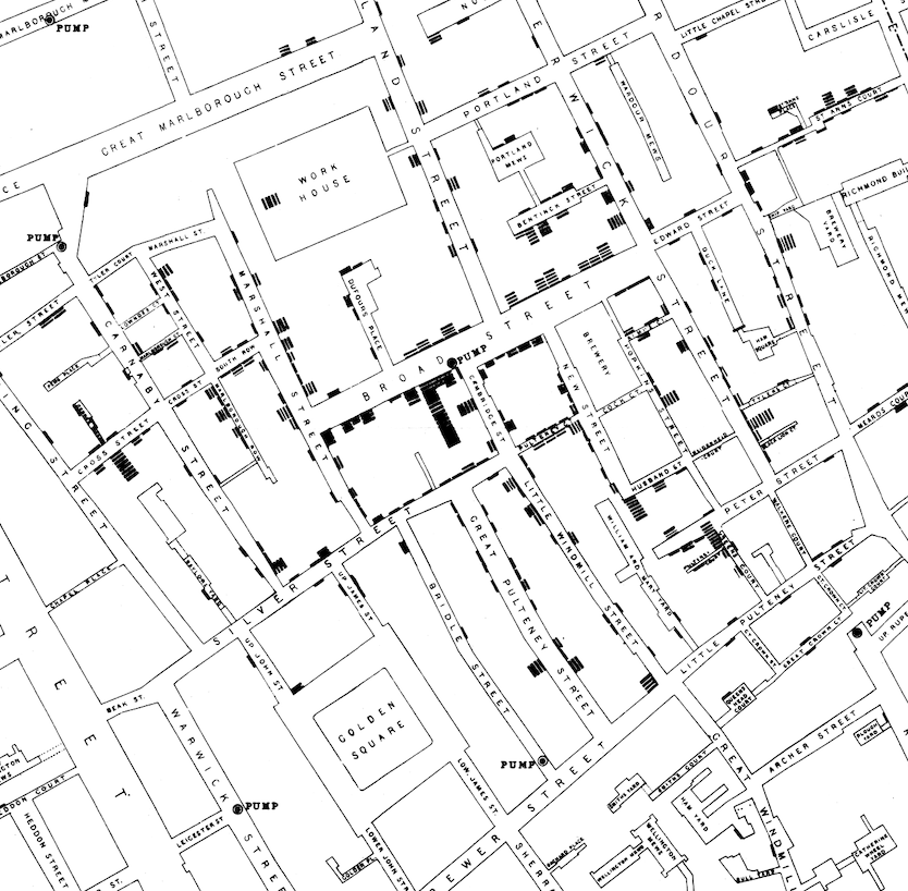
By mapping cholera cases in London, John Snow identified a public water pump on Broad Street as the outbreak's epicentre. His spatial analysis suggested that cholera was waterborne, not airborne, as widely believed, fundamentally changing public health policies and the understanding of disease transmission.
Minard's Map of Napoleon's Russian Campaign of 1812
Question: What were the significant factors in the catastrophic loss of Napoleon’s Grande Armée during the Russian campaign?
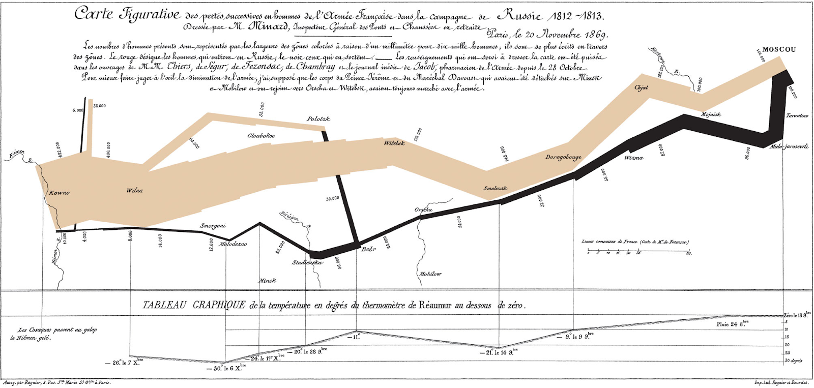
Charles Minard created a map depicting Napoleon's army's size and the temperatures they encountered on their retreat from Moscow. The stark visualisation highlighted the severe losses due to the harsh winter and logistical failures, offering a compelling narrative of strategic disaster.
Deforestation in the Amazon Rainforest
Question: How has deforestation progressed over the years in the Amazon rainforest?
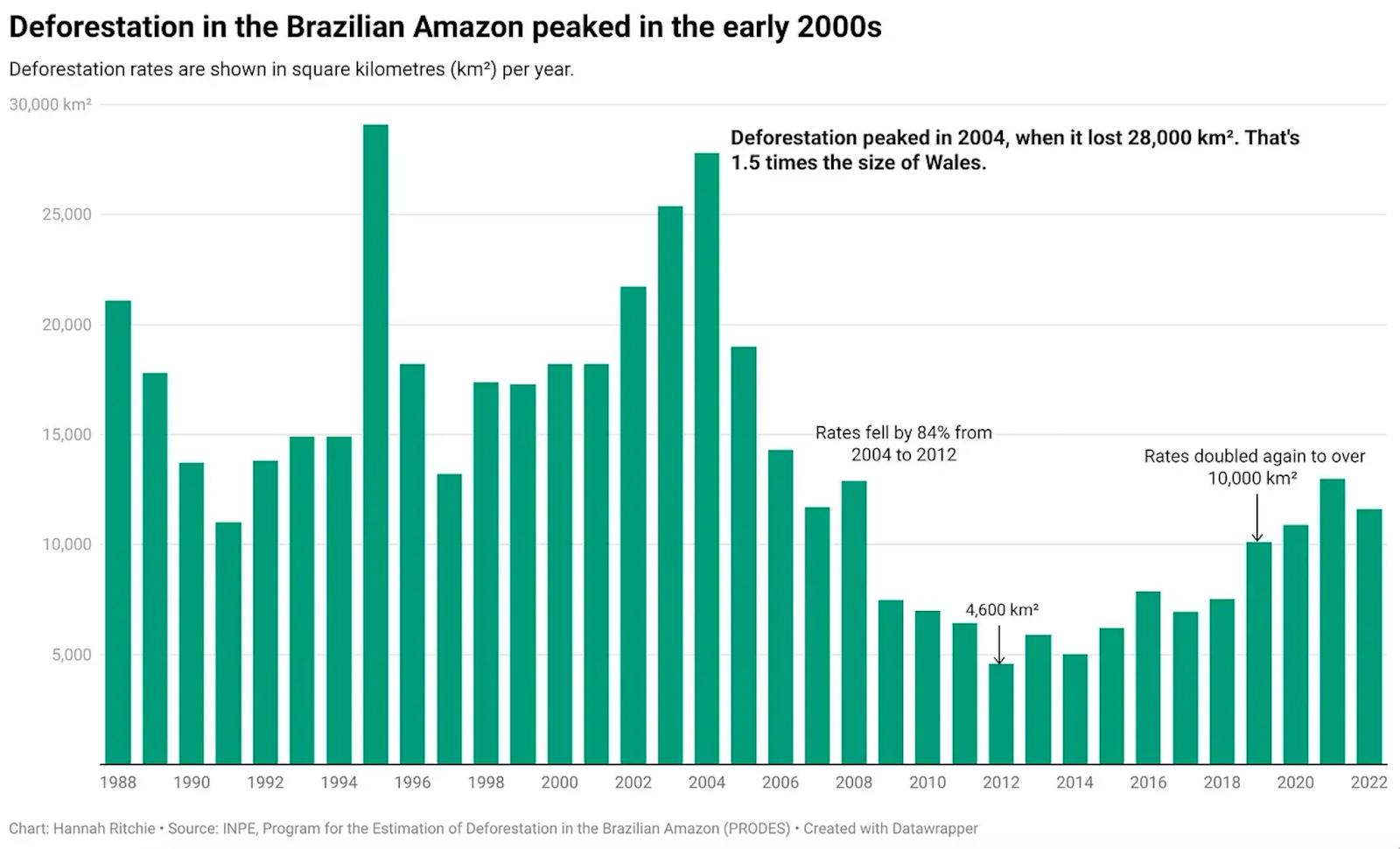
Using satellite imagery and GIS data analysis, researchers have been able to track the rate of deforestation in the Amazon, providing insights that have led to international environmental policies and efforts to reduce tree loss and preserve biodiversity in the area.
Each of these examples provides significant insights and has helped shape future strategies and policies in its respective areas.
In the next section, we will examine possible map projections to help us visualise and compute any statistics and features from our data.
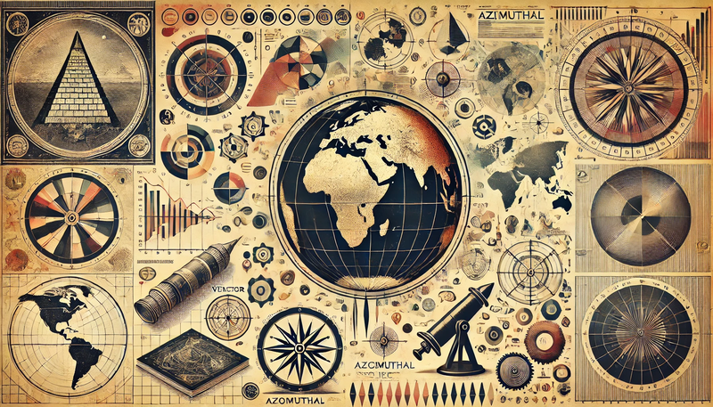
Map Projections
Considering we mostly look at maps on screens and projections, we need to depict the planet accurately in these scenarios. Unfortunately, projecting a globe on a 2D projection is not easy.
There are many ways to project the globe, each with its weaknesses. The most famous projection type is the Web Mercator, commonly used in online mapping services like Google Maps. However, it distorts size and distance as one moves away from the equator.
There are many videos showcasing this distortion, which is helpful to know as it can deceive many people as one of the most commonly used maps in the world.
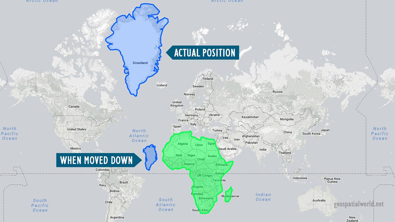
In this example, Greenland is much smaller than Africa, even though they both look the same in terms of area on the map.
Several other types of projections are used to address different needs, and we will provide a few more details here so you know when they can be used.
Conic projections
For example, Albers Conic is favoured for regional maps as they accurately represent area and shape. It is often used for thematic maps of the United States where area integrity is essential, such as electoral college maps requiring proportional representation.
Its ability to maintain a reasonable compromise between shape and size is precious in educational and policy-making contexts where a reasonable approximation of both dimensions and shapes is required to make informed decisions.
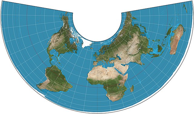
Azimuthal projections
These projections maintain true direction from the centre point to any other point on the map. This makes them particularly useful for applications like air navigation or antenna farms where directional relationships are crucial. Pilots and radio operators, for instance, can rely on these maps for accurate bearing information from their central location to any other point.
They also maintain a real distance from the centre point, which is crucial for meteorology (storm tracking from a central radar source) and logistics (calculating distances from a central hub).
Considering that most projections distort the polar regions the most, using polar-centred projections like these allows us to make the best representation of the poles.
Another interesting fact is that routes representing the shortest path between any two points on the Earth's surface (great circles) are displayed as straight lines in many azimuthal projections. This property is handy for flight planning and maritime navigation, where following a great circle route is economically and technically beneficial.
Cylindrical projection
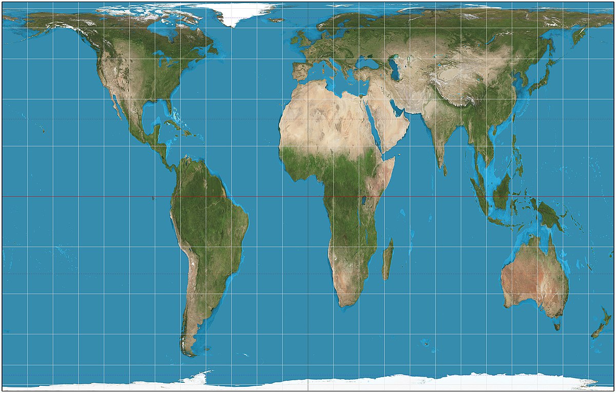
These are the most famous types of projection maps, with the Mercator being one of them. The Mercator is used for nautical navigation because it accurately portrays angles. For projects requiring accurate area representation, equal-area projections are preferred, such as the Gall-Peters projection, which shows areas such as Africa and South America in true proportion but at the cost of severely distorting the shape.
Geospatial Data
Vector Data
To work with geospatial data, it is essential to have some knowledge of geometry and vector operations. Understanding that vectors can do more than create arrows opens up a world of possibilities, including using them to represent geographic objects.
Geodata is usually represented as vector data, and it is essential for representing discrete features on Earth, such as boundaries, roads, and landmarks.
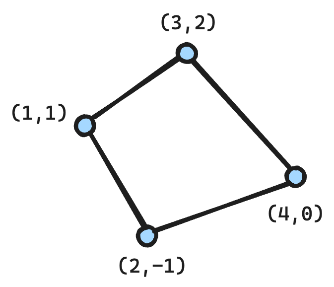
When learning to work with Geospatial Data, you will likely work with Shapefiles and GeoJSON formats. These provide you with sets of coordinates, which you then connect and draw whatever you want in as much detail as you need. The example below shows a group of coordinates defined as a Polygon type.
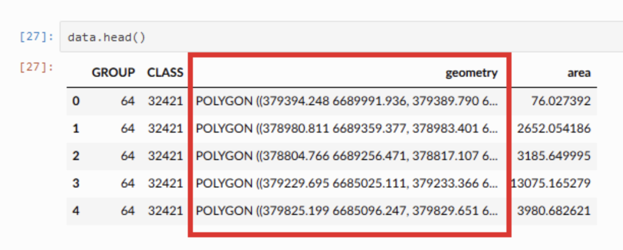
For example, a Polygon object connects each of the coordinates, including the last, with the first coordinate, creating an actual polygon.
The types of geometry typically include:
- Points: Represent specific locations like cities or water wells.
- Lines: These are used for linear features such as rivers or street networks.
- Polygons: Define areas like lakes, national parks, or urban footprints.
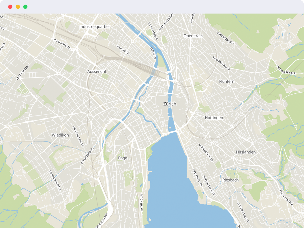
Most of what you see in your map services is vector data, so they should look nice even if we get too close.
Vector data becomes even more valuable once we include attributes with it. These are additional data stored in a tabular format. Attributes may include names, types, addresses, or other information characterising these shapes. For example, the tabular example above has a group and a class associated with each geographic object.
Raster Data
Raster data represents the Earth's surface as a matrix of cells, each with a value representing attributes such as altitude or vegetation index. This is great if we want to represent data as a continuous variable.
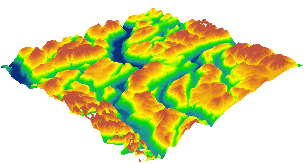
Raster data essentially consists of:
- Grid of Cells: Each cell in a grid contains a single value.
- Cell Size: Determines the spatial resolution of the data, where smaller cells allow for higher resolution and more detailed information.
- Raster Band: Rasters can have multiple bands, each representing a different dataset layer, such as different spectral bands in satellite imagery.
Raster files are very dependent on the metadata, which describes the raster’s properties, such as cell size, number of rows and columns, projection, coordinate system, and data type of the cell values.
Regarding Raster formats, GeoTIFF is preferred for high precision and detailed metadata support, JPEG 2000 for efficient compression, and NetCDF for multidimensional scientific data.
Final Note - Metadata
Always search for metadata in GIS as it provides detailed information about the data's source, accuracy, and content. It might be your source of information on the projection, collection dates and explanation of the different attributes. This helps ensure that the data are used correctly and that analytical results are interpreted appropriately.
Conclusion
You're now equipped to ask captivating Geographic questions, choose the ideal map projections, and navigate vector and raster data realms.
When I first dived into Geospatial Projects, I was swept away by a whirlwind of fascinating ideas and historical gems. This post compiles the essentials to launch your journey, but the real thrill lies ahead. As you delve deeper, you'll unravel even more layers of complexity and wonder, so gear up because an exciting expedition into the world of geospatial data awaits you!